
Redesigning AT&T's Top Revenue Flow
Reducing Friction
23 fragmented steps, 98% drop-off. Users couldn't complete their order online.
Leadership aimed to boost conversion 60%, cut drop-off in half, and deliver one seamless flow.
My team and I redesigned it into a single, personalized checkout, delivered in 3 months, 80% faster than the standard 18-month process.
Role: Product Design Lead, owning the process end-to-end across Product, Merchandising, Engineering, and Amazon Creative Services.

Effortless. Simple. Adaptive.
Working cross functionally with Research, Product, and Engineering, we refined the experience through 5 testing rounds and 400+ surveys.

Design System
I contributed to scaling design consistency across a complex commerce platform.
Core system elements: grid, color, typography, and reusable components.


V2: One single canvas

Version 1
Preselected options sped up checkout, but reduced trust and transparency.
Version 2: winner
A user controlled, single screen flow. Preferred by users.
Optimizing Conversion Across Upgrade Journeys
Business needed upsell and trade-in revenue. Customers needed speed and clarity. Trade-in, upsell, and checkout speed all competed for the same screen. I consolidated them into one canvas, based on testing showing users preferred control over a preselected flow.


Optimizing Conversion Across Upgrade Journeys
Business needed upsell and trade-in revenue. Customers needed speed and clarity. Trade-in, upsell, and checkout speed all competed for the same screen. I consolidated them into one canvas, based on testing showing users preferred control over a preselected flow.

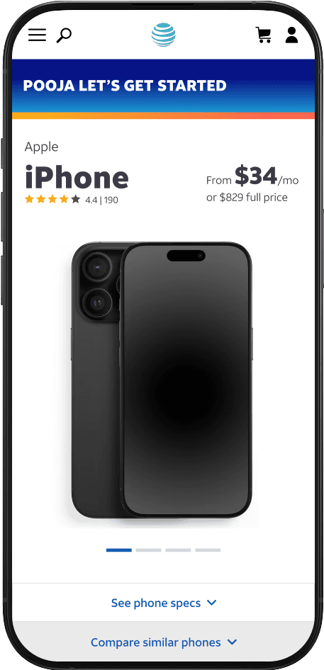
Doubled Conversion
Rolled out in just three months, this drove a 230% spike in online upgrades, setting a new company record.
This approach became AT&T's model for high friction checkout flows, applied across future device launches.


