AT&T iPhone upgrade
Product design strategy drove 230% growth and 80% faster time-to-market
Streamlined for impact
A clunky, uneditable multi-step flow frustrated iPhone upgraders. Reducing it to 8 editable steps doubled online upgrades with a smoother, flexible, and personalized experience.
Role: UX Design Lead and Creative Director, collaborating with 9+ Product teams, Data, and Engineering.
Effortless. Simple. Personalized.
Refined through 5 testing rounds, focus groups and 400+ surveys, the experience delivered customization with editable flows, clear pricing and intuitive choices.
Consistent & Refined Flow
AT&T’s refreshed global design system shaped a unified and delightful experience across the customer journey.
Prototyping & User Testing
One Click, Low Trust
Version 1 preselected options for convenience, but users felt unsure, double-checked details, and saw the flow as upselling with limited transparency.
One Canvas, Full Control
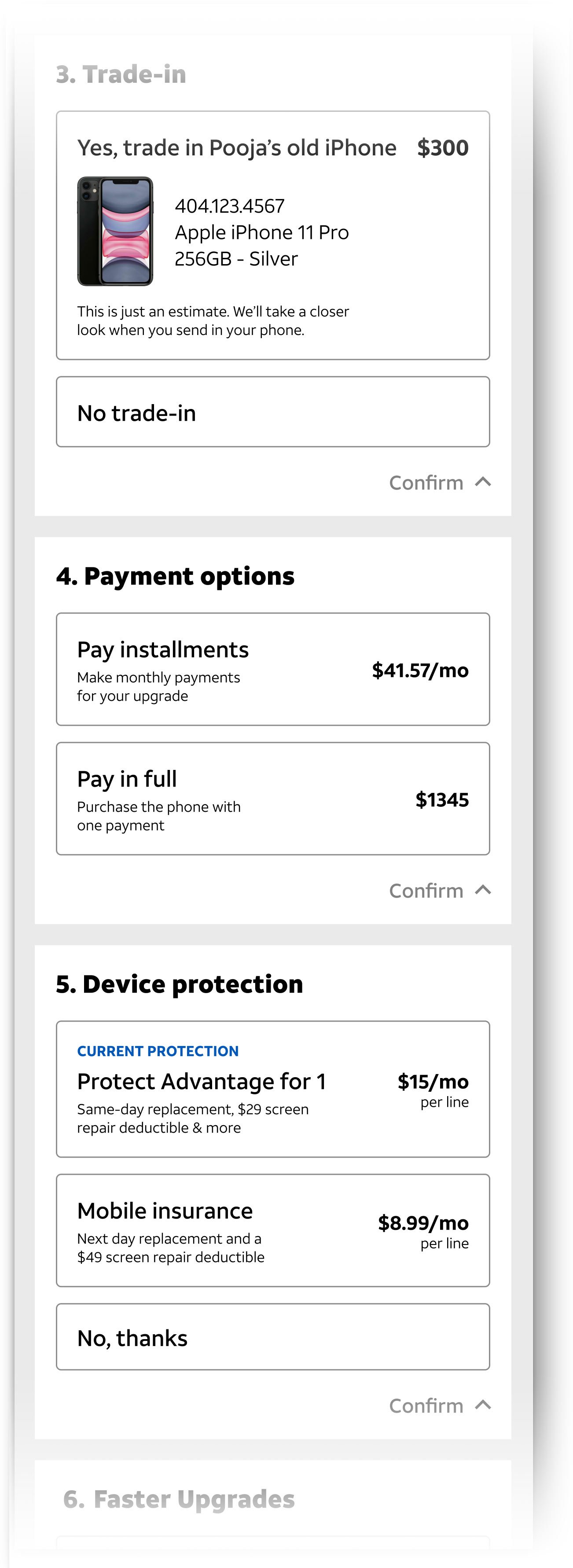
Version 2 delivered a customizable, single-screen experience, giving users full control while boosting confidence, transparency and engagement over V1.
Refined Experience
One Single Canvas Approach
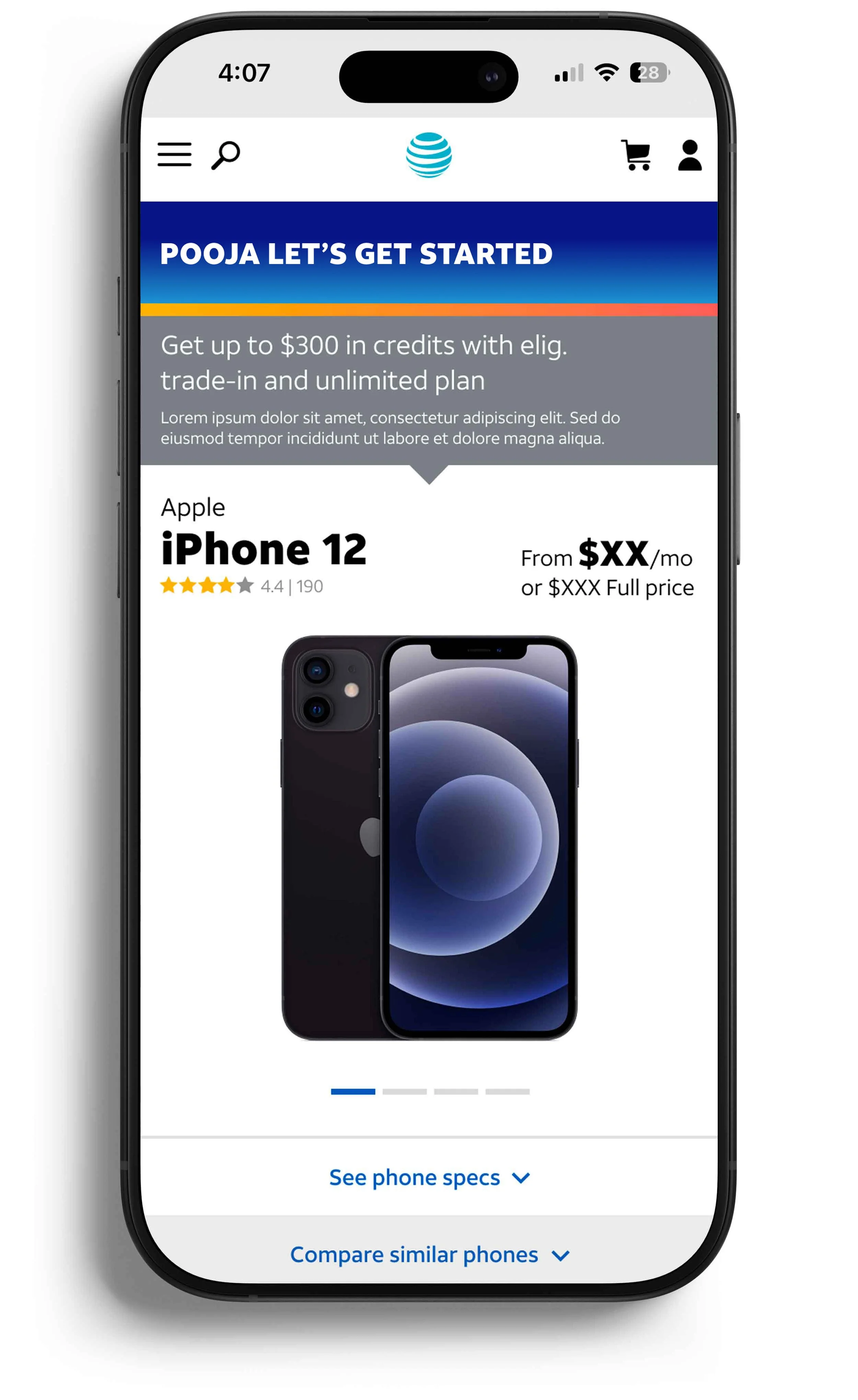
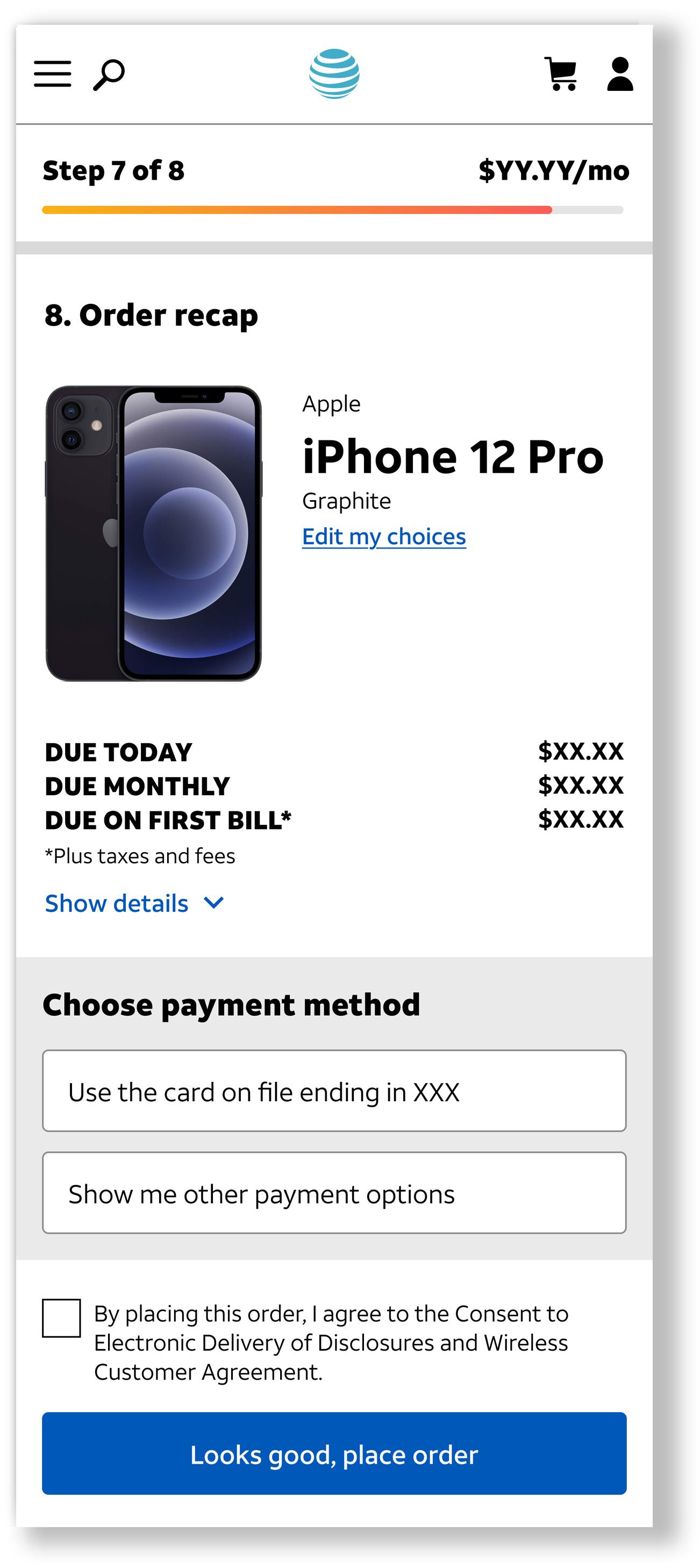
A unified screen let users enjoy the full upgrade process with device comparisons, customization, collapsible sections, and real-time cost tracking.
Doubled Upgrade Growth
Rolled out the single canvas flow in 3 months, resulting in a 230% spike in online upgrades and setting a new record.


