
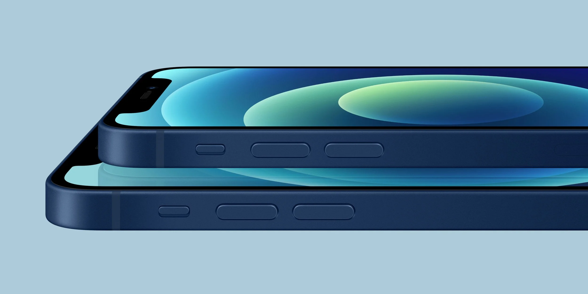
AT&T Iconic Launch
The Strategy Behind Doubling Online Upgrades
Challenge
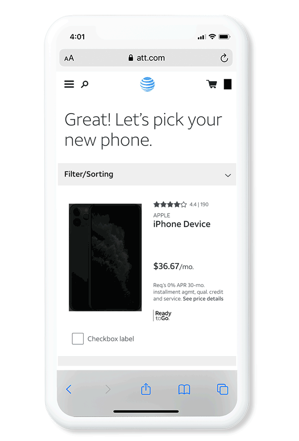
Customers struggled to complete their iPhone orders due to a confusing 24-step, uneditable flow. Irrelevant content added unnecessary friction. This created a frustrating experience for those eager to upgrade.
Solution
In a cross-collaboration effort, my team and I reduced the process from 24 to 8 steps, enabling customers to edit their configuration at any point. This simplified, personalized, and engaging experience improved user flow and satisfaction.
Results
Online upgrades increased by 230% year-over-year, setting a new sales record. The streamlined experience allowed for flexible configuration and quicker checkouts. Time-to-market was cut from 18 to 3 months.
My Role: Design Lead: Branding, UX, UI, Interaction Design.
Team Partners: Product Management, Data, Engineering.
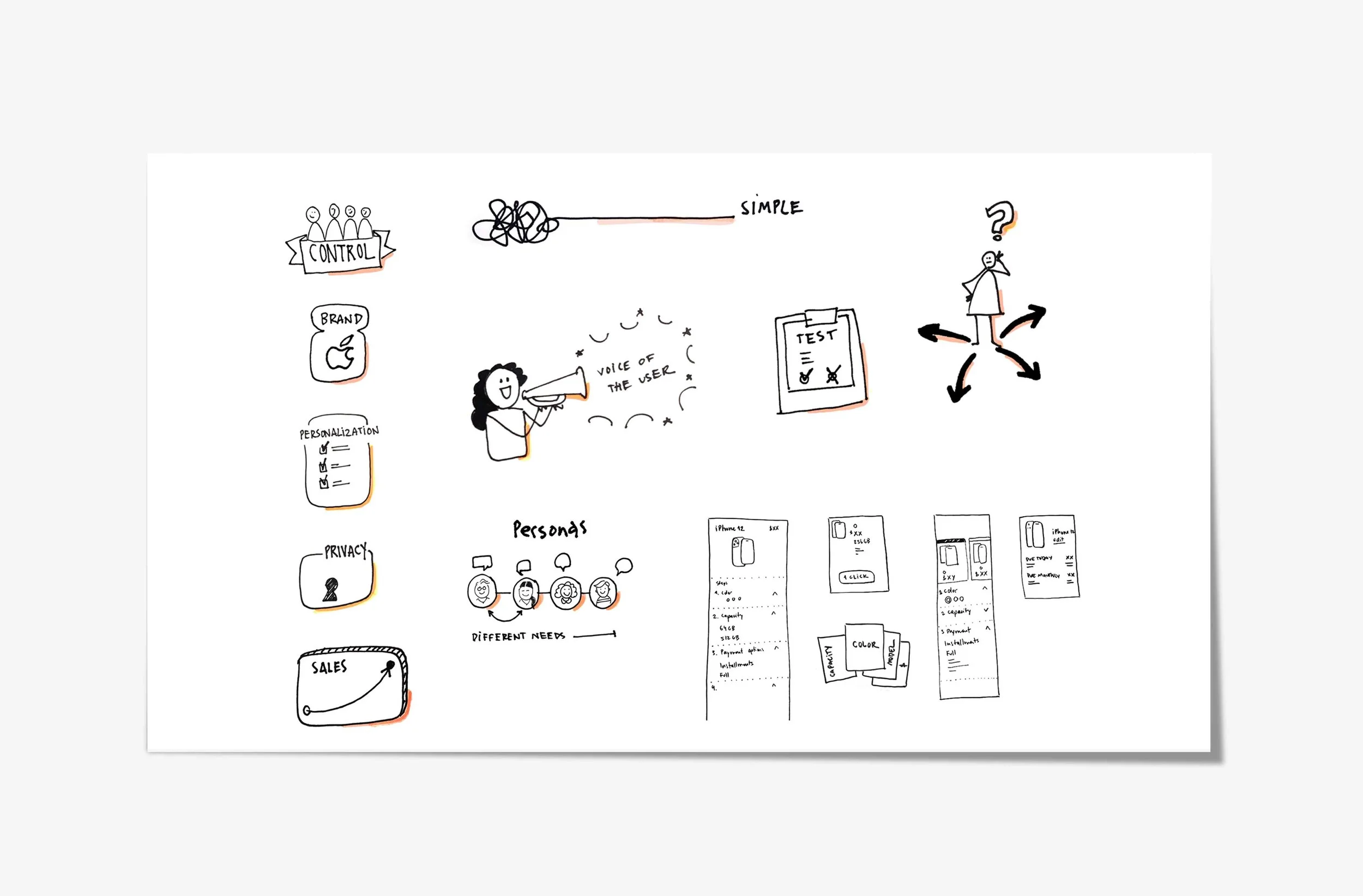
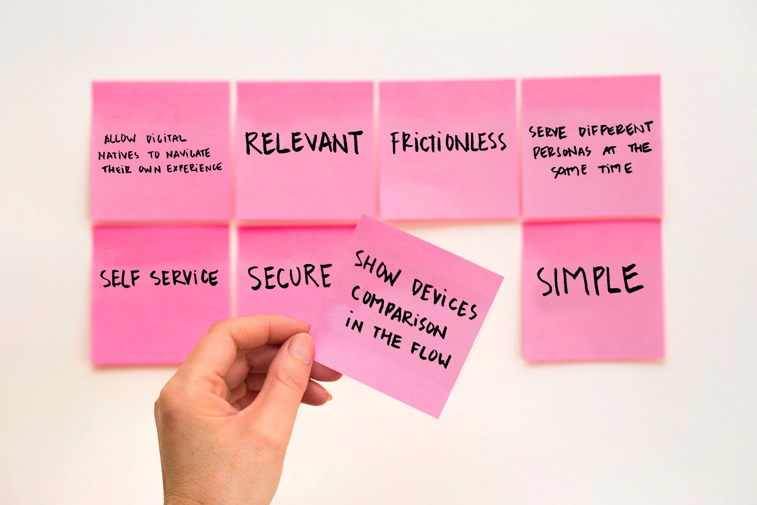
Goals
Seamless Configuration: Enable edits at any stage for a smooth experience.
Streamlined Flow: Cut the process by 50% for faster navigation.
Effortless Experience: Reduce fallout by 60% and service contacts by 25%.
Main Personas

JASON, Businessman, Traveler
Motivations: Early access to the newest technology Frustrations: Complexity of tasks online

SAM, Saleswoman, Tech-savvy
Motivations: Accessible on-the-go
Frustrations: Can’t find relevant info online
Use Case Storyboard
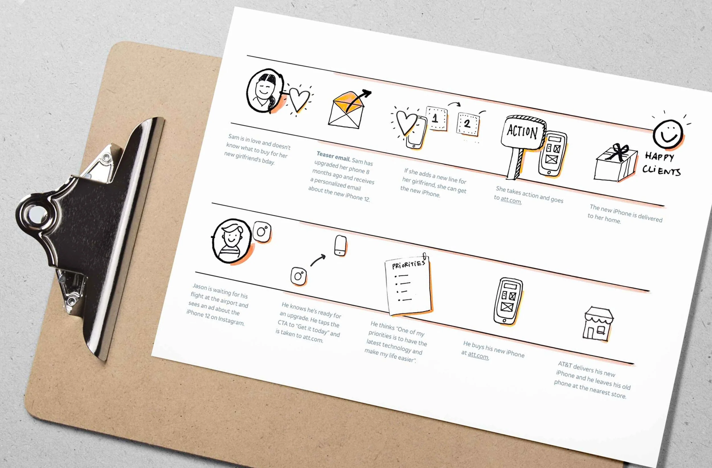
The experience was designed to meet the needs of early adopters like Sam and Jason, ensuring the solutions aligned with their preferences.
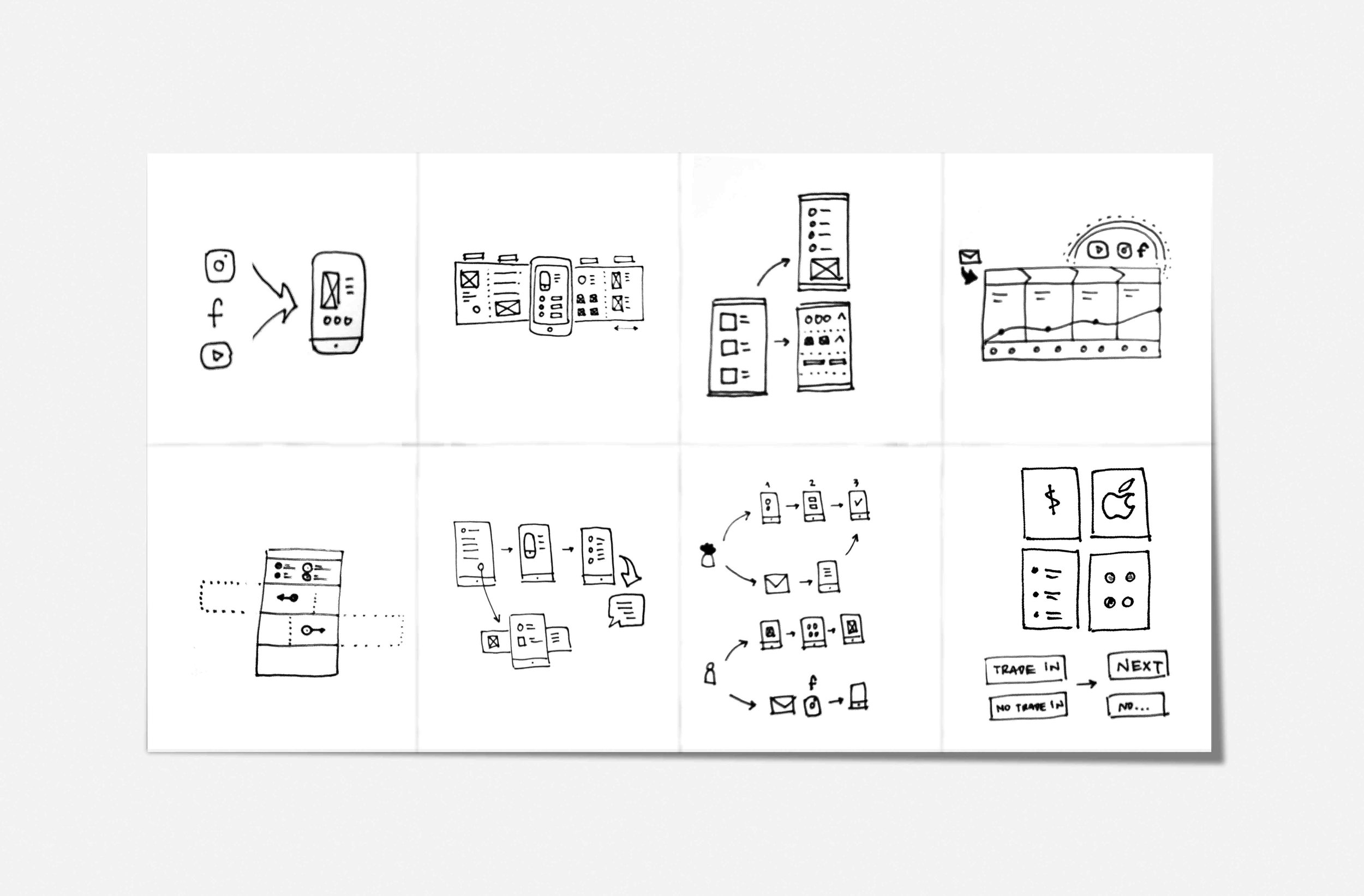
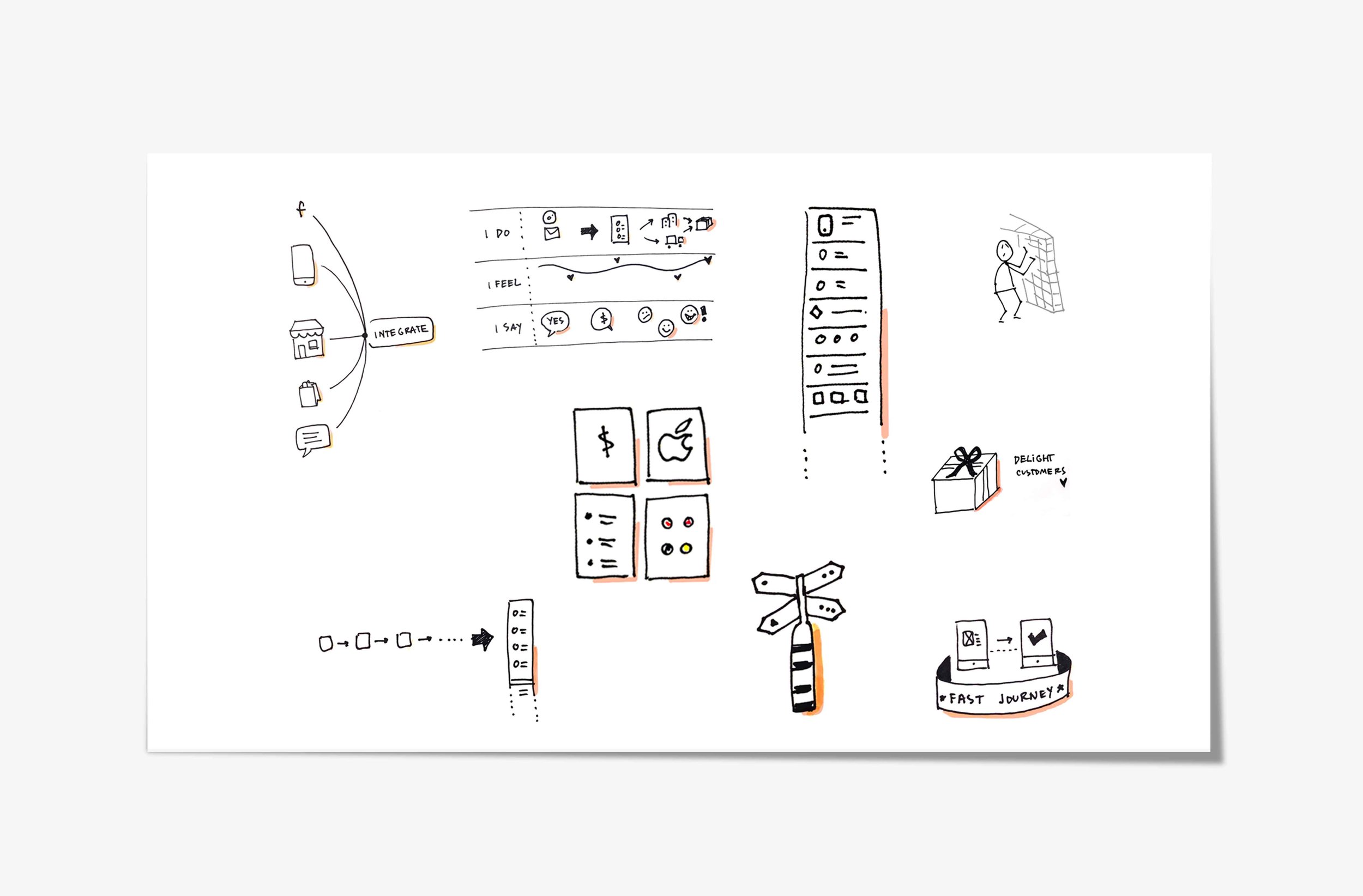
Ideation phase
We explored numerous concepts to remove roadblocks, offer control and personalization, ultimately delighting customers.
How might we
How might we enable users to complete their purchases independently?
Vote and decide

The pre-configured option “1 click” (top right) got many votes, but research showed customers preferred setting up their phone (top left).
User Research

“Could not be happier with how cohesive the process is. It’s lovely to set up my new phone!”
User Testimonial
Insights from +400 Interviews

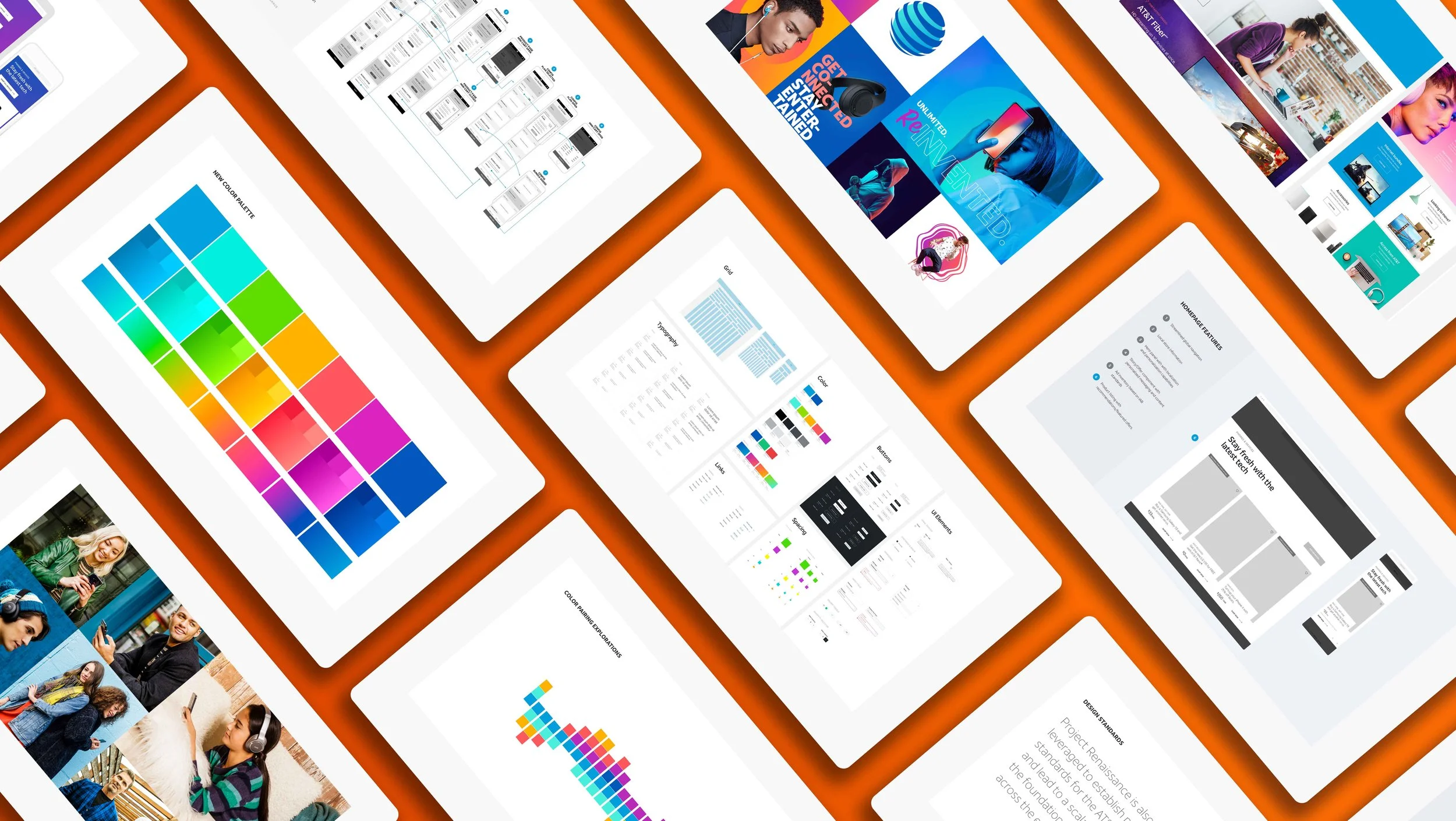
The iPhone launch experience successfully leveraged AT&T's newly introduced global brand design system, ensuring a cohesive and modern customer journey that aligned with the brand's updated identity.
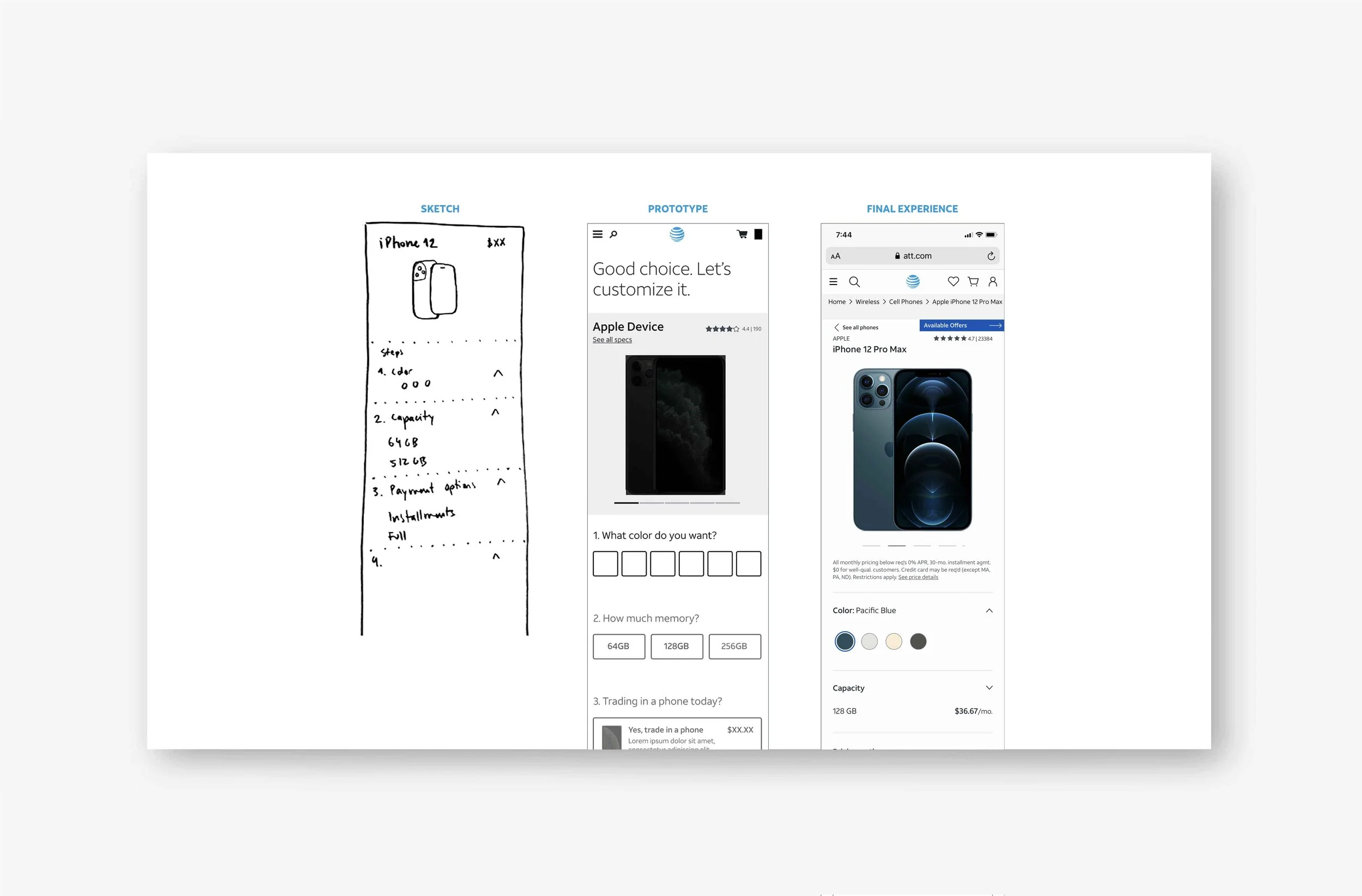
Sketch, Prototype, Live content
Experience
EXPAND/COLLAPSE
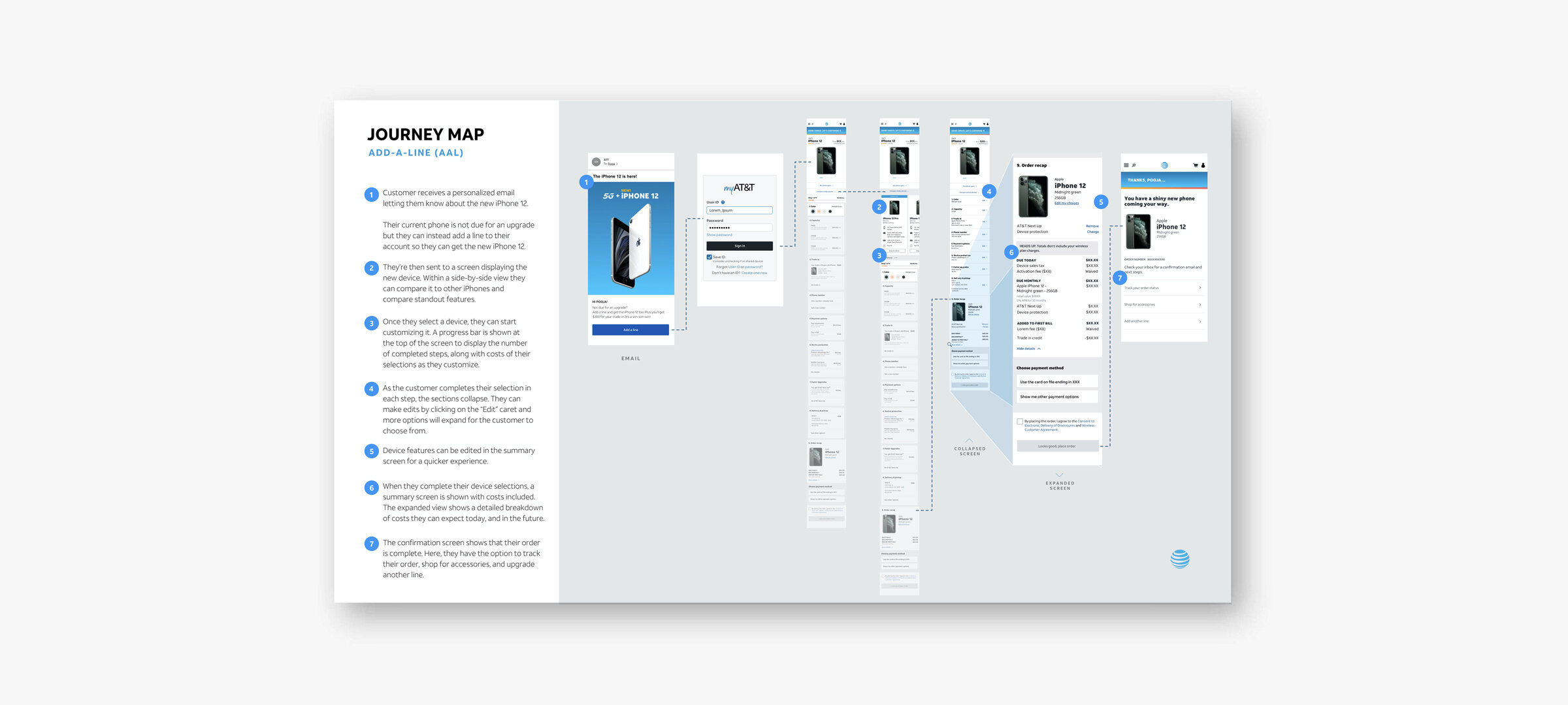
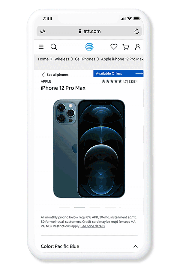
Inactive sections in the flow are grayed out. As customers make selections for each step, sections collapse, revealing the next step. Expand/collapse is used for progressive disclosure of details throughout the flow.
EDITABLE
It’s a single canvas approach that allows customers to edit their configuration at any point in the flow and Cart, keeping them engaged to complete the purchase and reducing customer service calls.
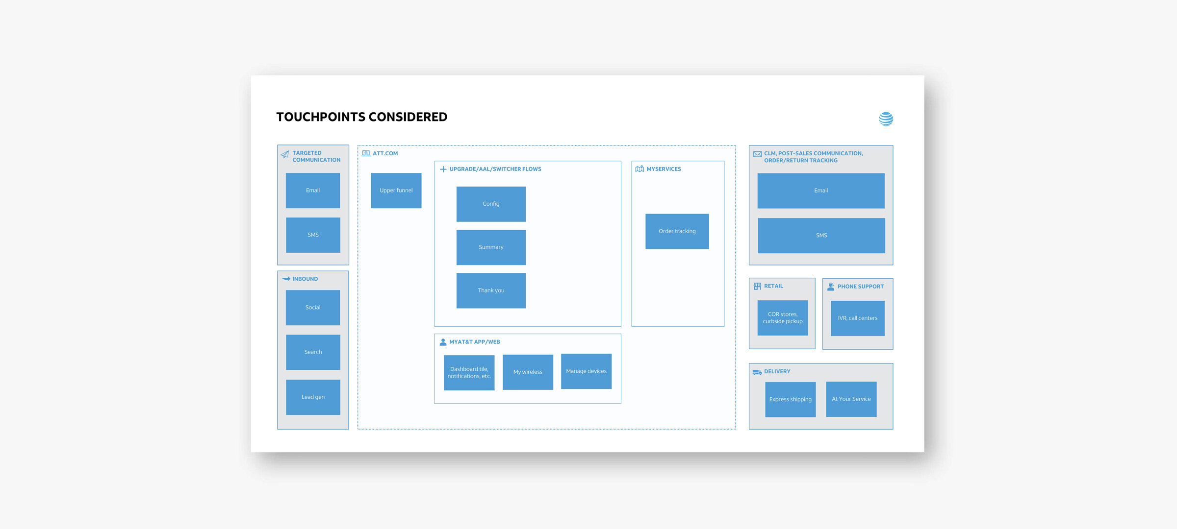
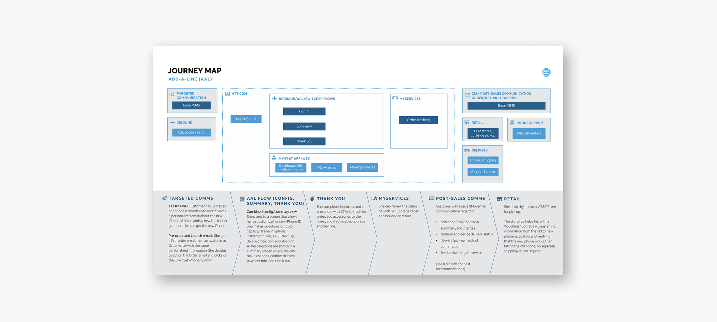
END-TO-END EXPERIENCE
The journey is personalized and relevant to the user—from the teaser email they receive to the experience at att.com, post-sale support, and product delivery.
Prototype
Live Content
Results
Online upgrades surged by 230% year-over-year, setting a new record! Time to market was reduced from 18 to 3 months.