SIGNATURE PROGRAM
A successful premium new experience for AT&T’s discount program.
CHALLENGE Unify The Signature Brand
The Signature Program is AT&T’s discount program in partnership with companies, schools, and organizations. The program was underperforming and needed a new experience.
SOLUTION Testing Into Brand Recognition
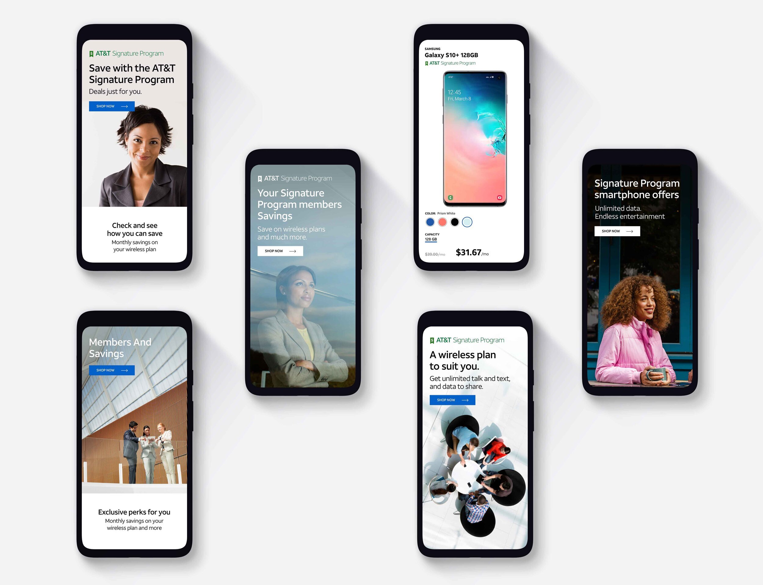
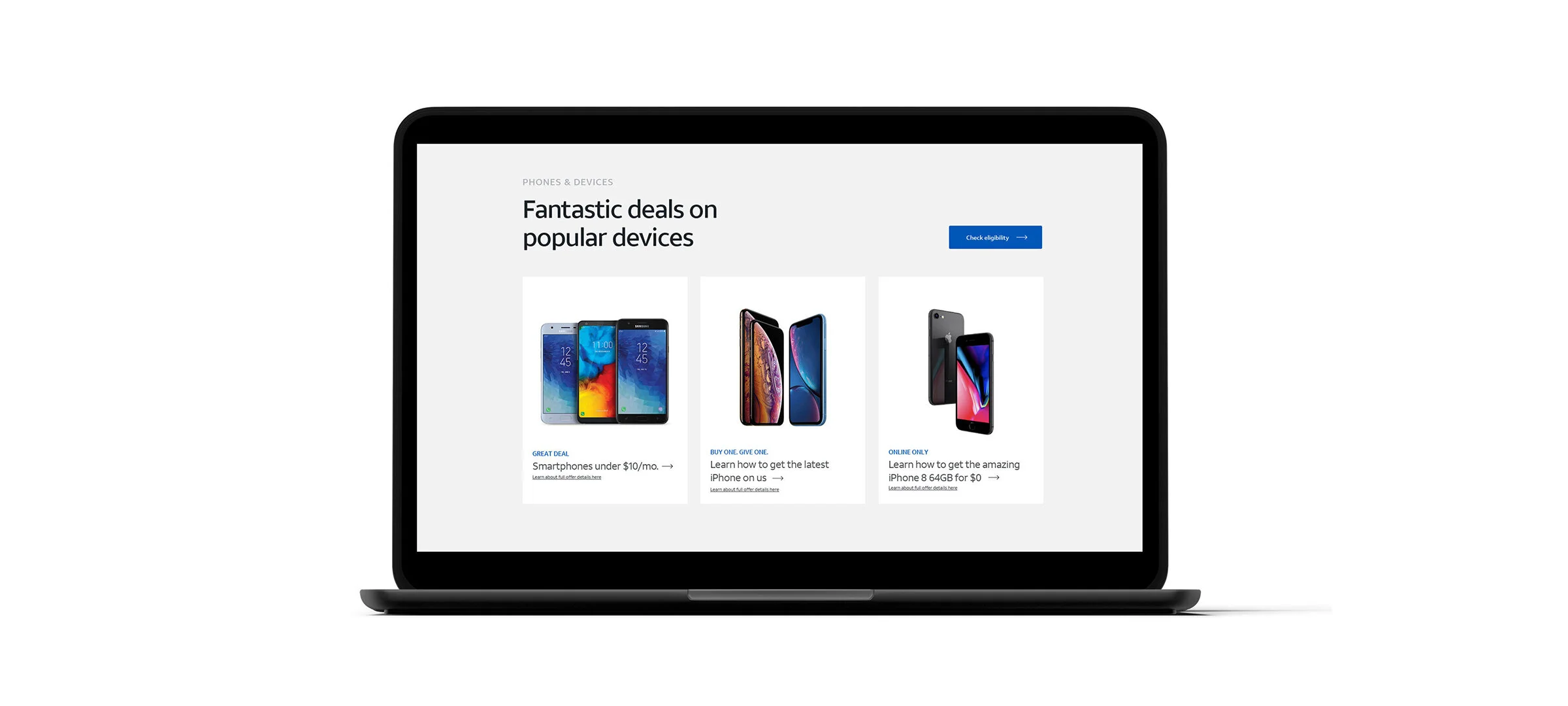
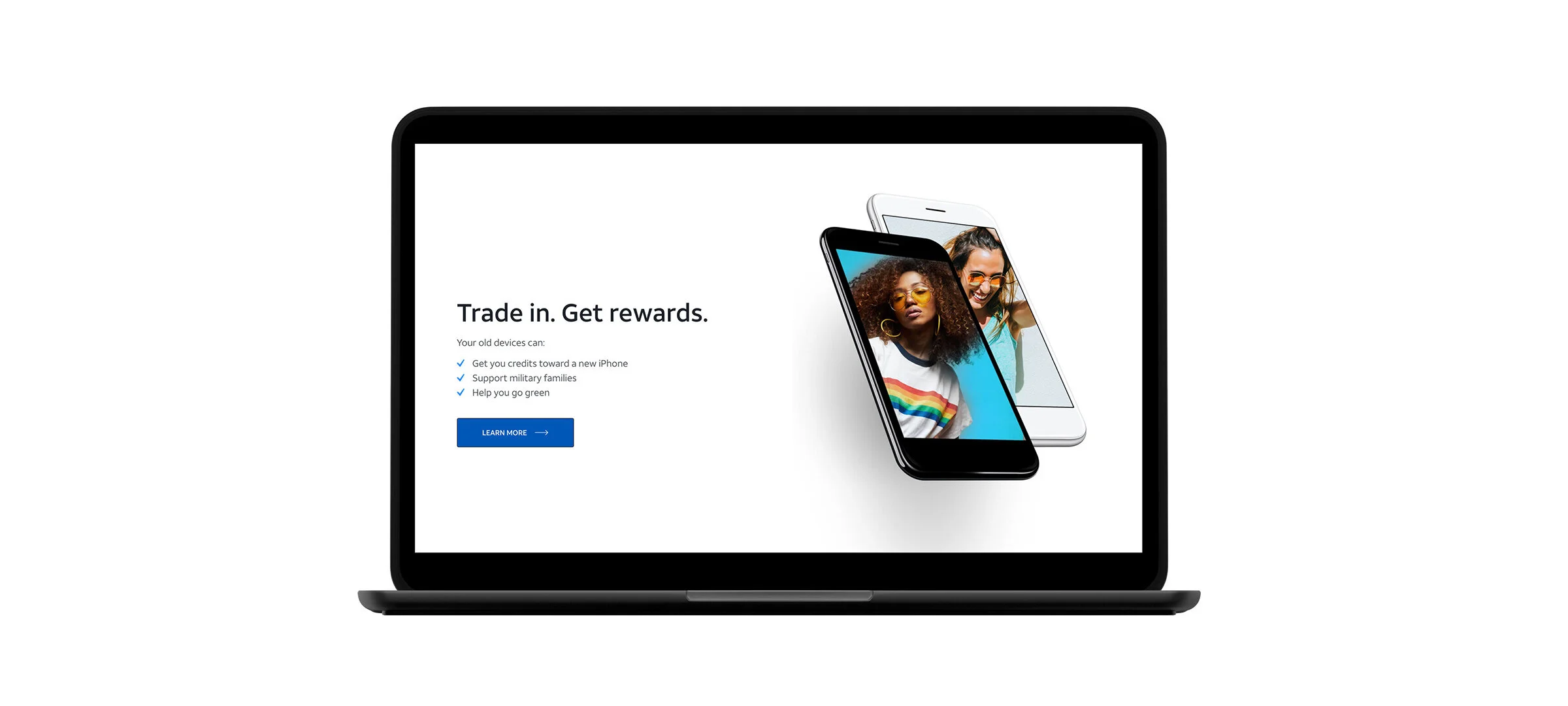
Based on user research, my team and I created and tested a new look & feel for the program. We also created a landing page template to make the entry point for all Signature customers consistent.
RESULTS Consistent and Branded
After launch, the number of customers completing their signup and account activation online increased by over 64%, accompanied by over 27% call shed. Cost savings will continue since updates can be completed through CSS changes and daily release.
My Role: Design Lead: Branding, UX, UI, Interaction Design.
Team Partners: Product Management, Brand, Data, Engineering.
BEFORE
Each organization's landing page was designed and developed as a one-off.
AFTER
The landing page template makes each page consistent and easy to update.
The process
Signature customers account for more than 60% of AT&T’s base—yet the user experience was a hodgepodge of styles that were launched over years.
The inconsistent visuals and messaging throughout the flow confused customers and performed poorly.
Our design team developed a two-pronged approach to user research. We worked with the brand team to develop original designs to survey users on overall branding concepts.
We tested inventive brand messaging placements throughout the flow against the current experience. In the spirit of build once, use often, all of the placements we tested were available in existing components.


